Farer – Typography Zine
Taken from the word “wayfarer” describing one who travels, especially on foot, Farer suggests curiosity and exploration.
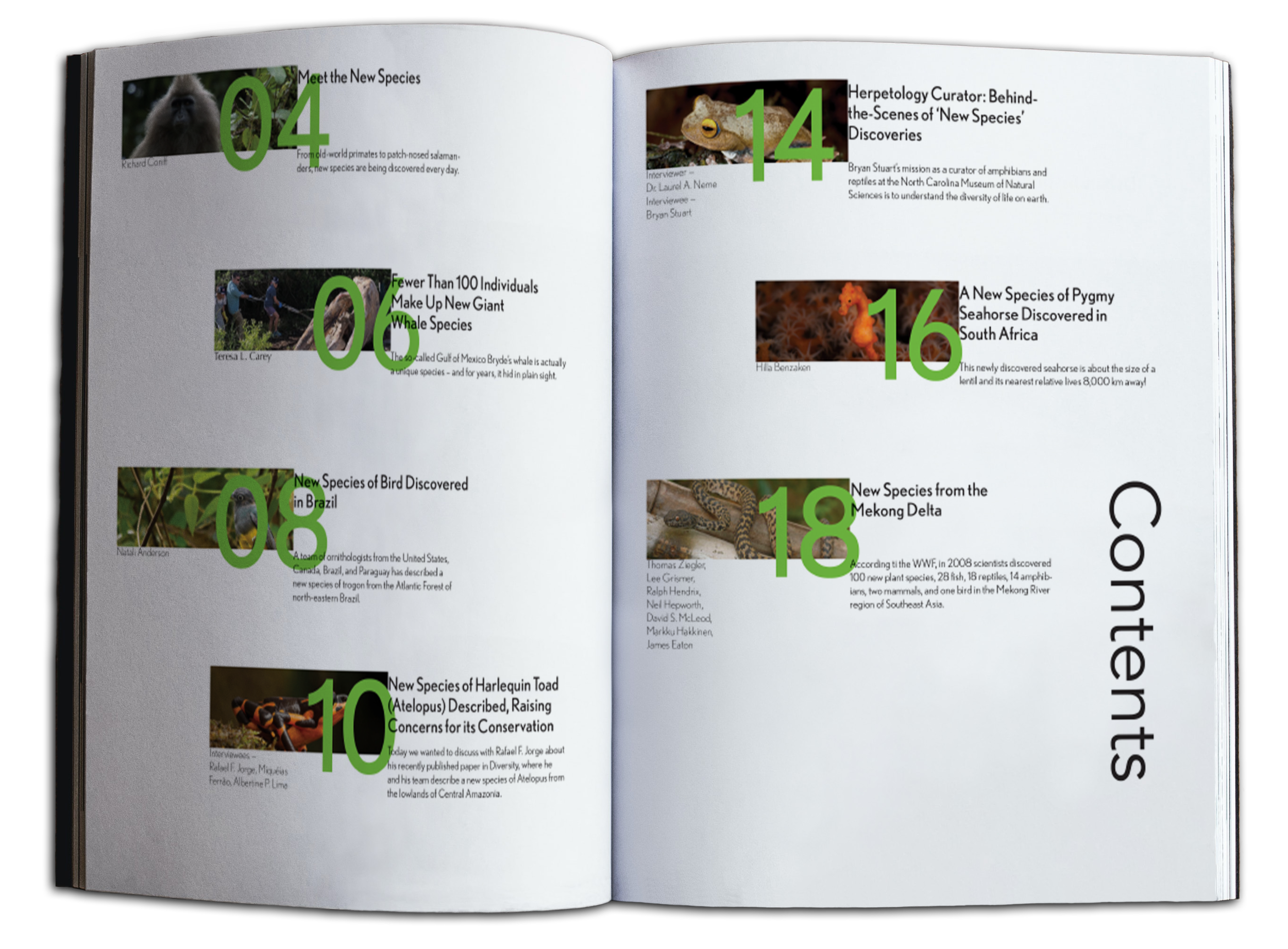
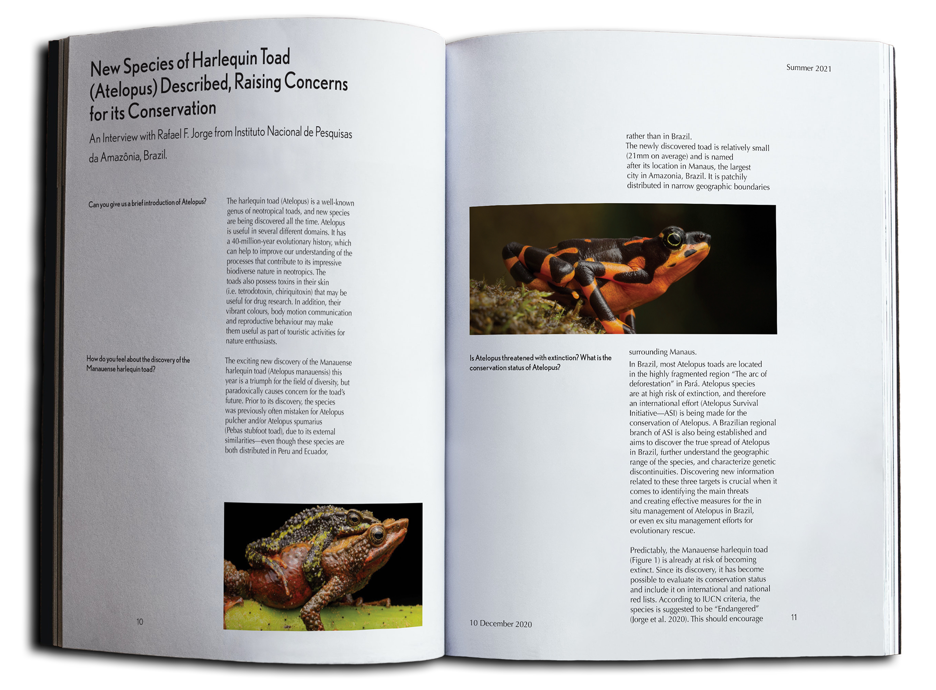
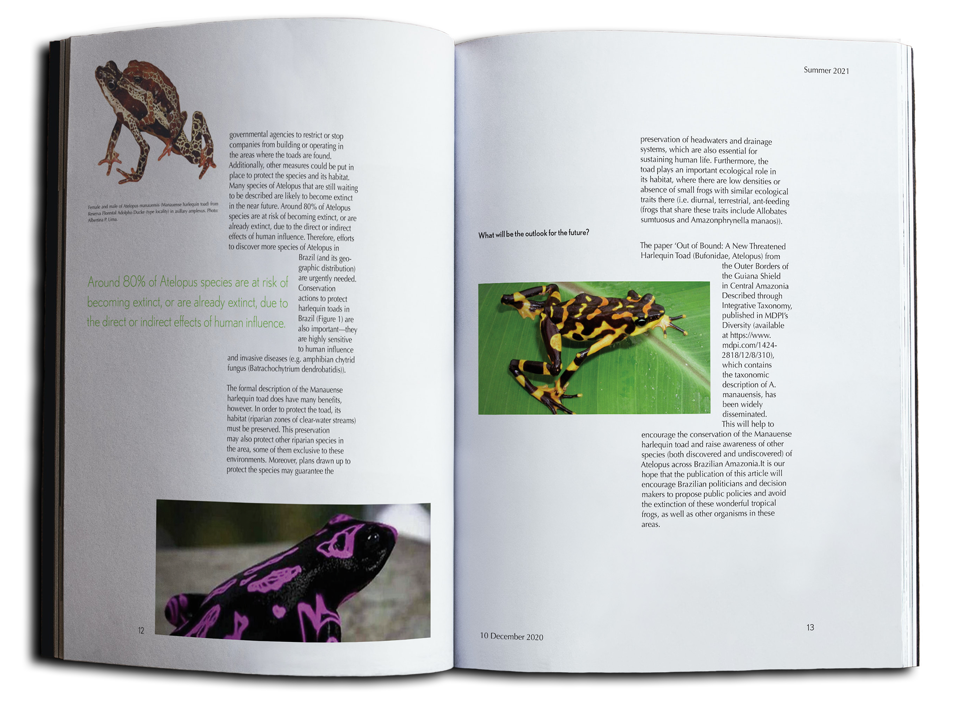
I set out to create a zine centered on the exploration and preservation of new and endangered species. This would include designing a wordmark, cover, table of contents, and four spreads for the publication.
Wordmark
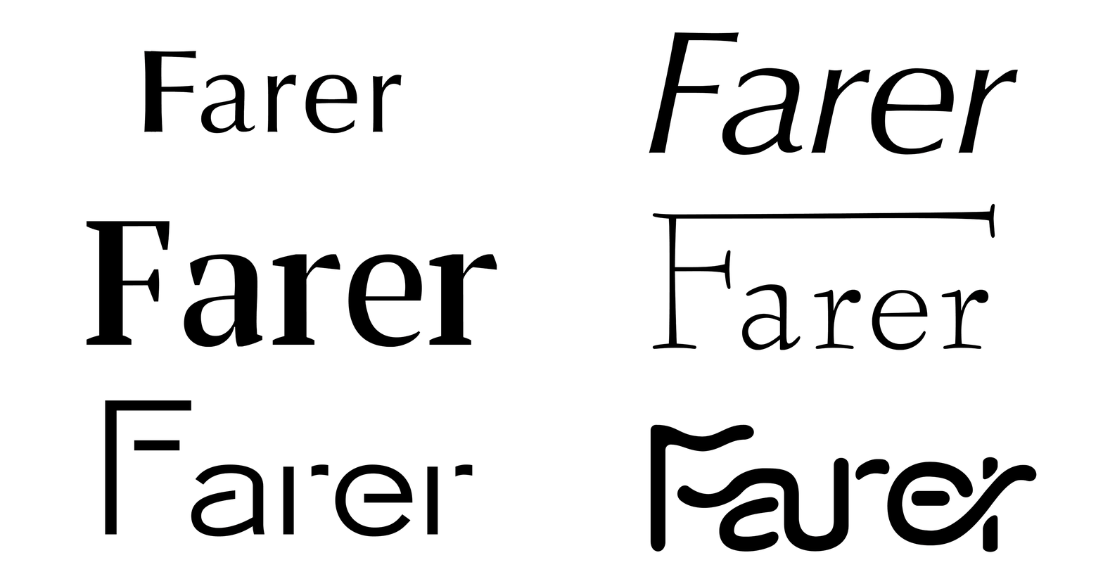
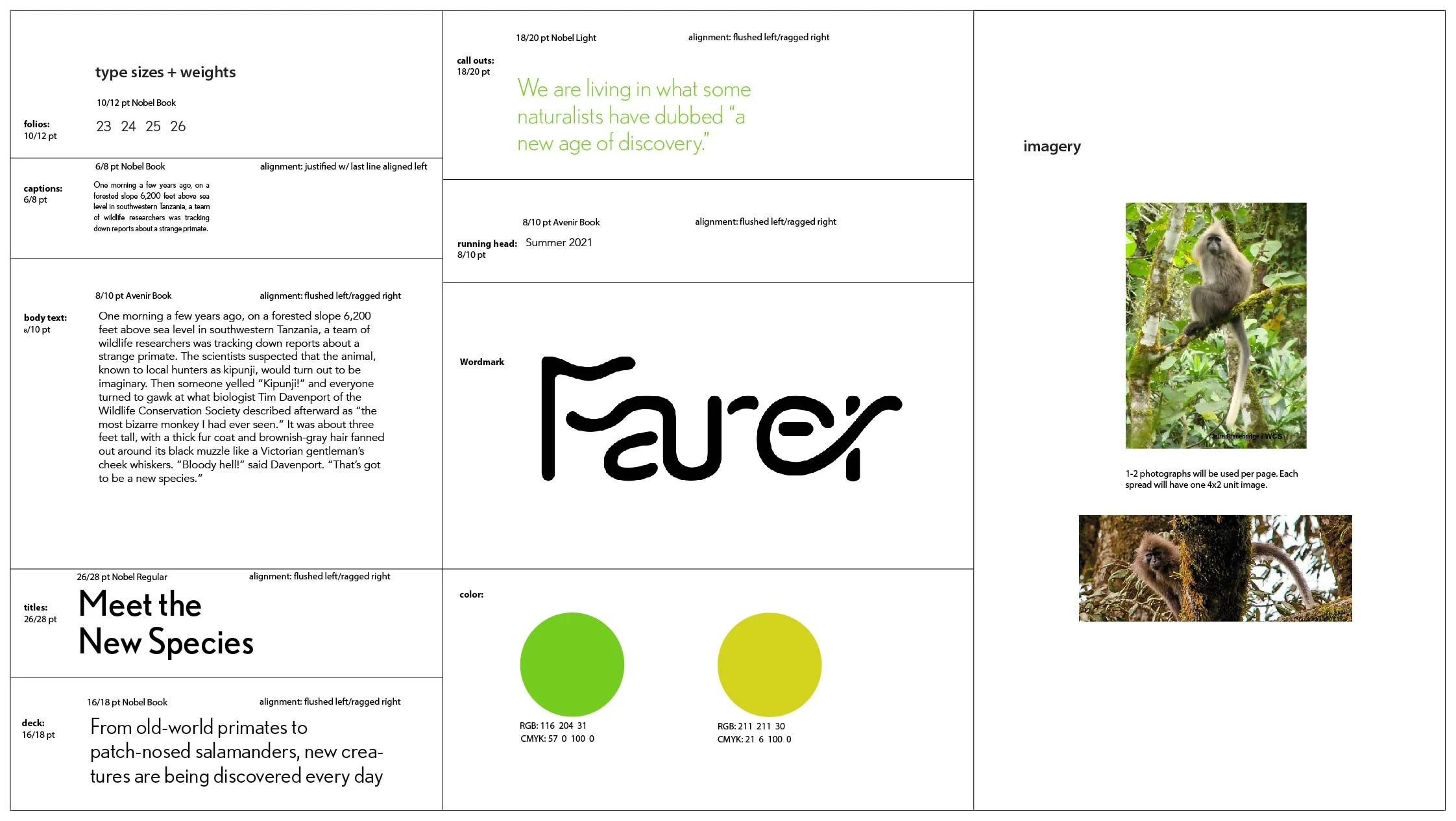
When creating the wordmark, I considered several sets of related words to explore the different design forms the publication may take. I settled upon the key words ”learn” and ”develop”. In order to express these ideas, I gave the wordmark an organic form, as learning and developing require growth and flexibility.
While developing the visual system, I settled on a sans serif typeface. This conveys a more modern feel and furthers the themes of ”learning” and ”developing” that I set out to express in the wordmark.
Style Guide
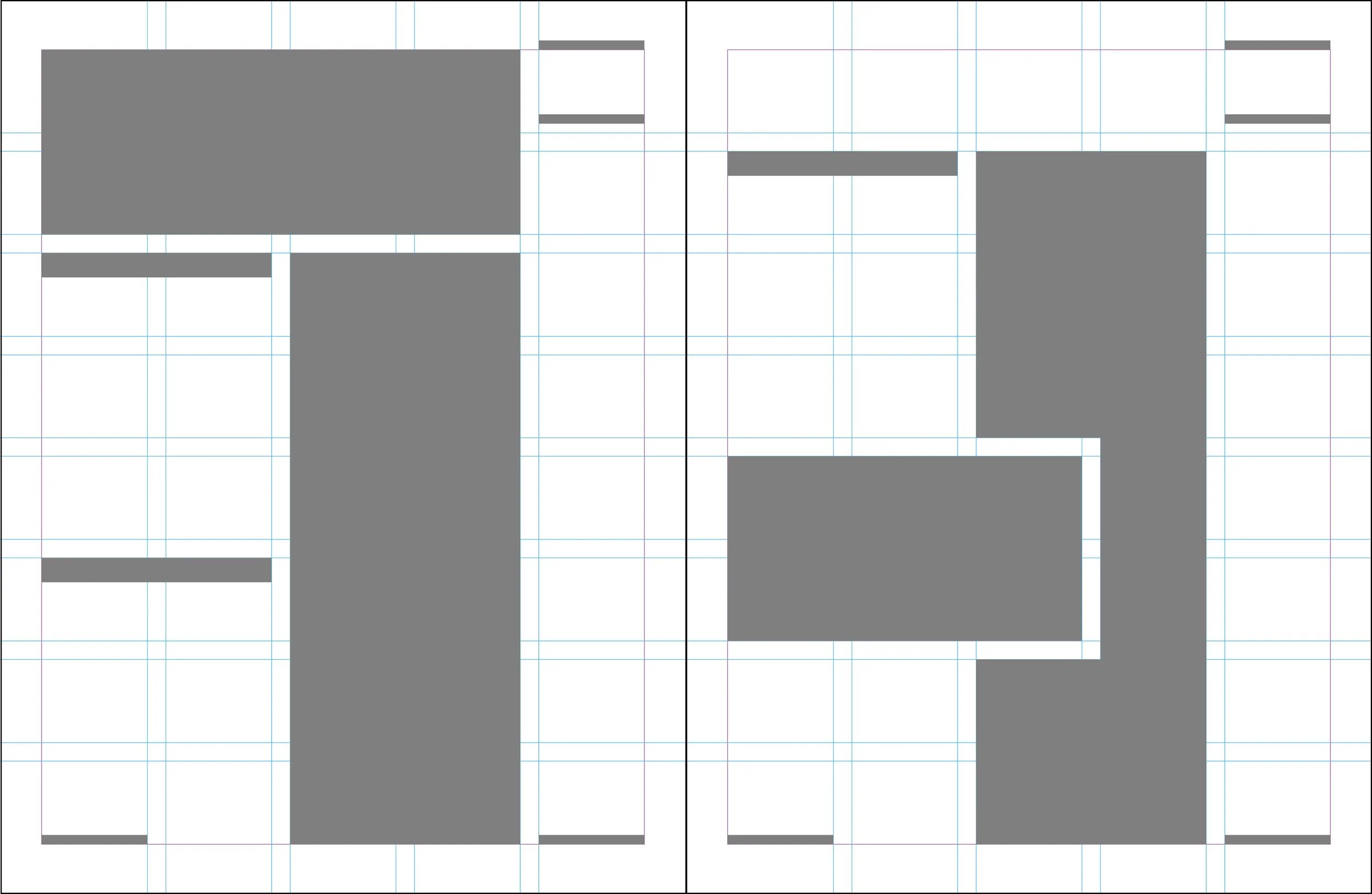
I was certain I wanted to keep images prominent in every part of my zine. This was to give readers the best opportunity possible to see animals they may never have heard of before. My final spread designs emphasize large photos to help the audience connect with the animals they are learning about and ragged text to give a more naturalistic feel.

